Feature

DNS Insights

Product designer
Team

Product designer

Product manager

Back end engineer

Front end development

Customers rely heavily on support just to navigate the dashboard.

Customers do not use the feature at all as there are 40 different metrics on a single page and they do not want to spend 6+ hours to customize a dashboard view. This results in low usage and risking users dropping the DNS Insights feature from their contracts.

Research found there is a right time for the right data

Spoke with 4 customers in 3 markets and found there is a universal process for troubleshooting issues and a shared pattern for when they'd check certain metrics.

Design direction & alternatives

I kept in mind new front end limitations and grounded the designs in how our users troubleshoot. Alternatives I looked at are:

Single page - long load time and higher risk of timeout errors

Header tabs - Cannot support a universal filter

Page zoom bar - Front end limitations

Solution
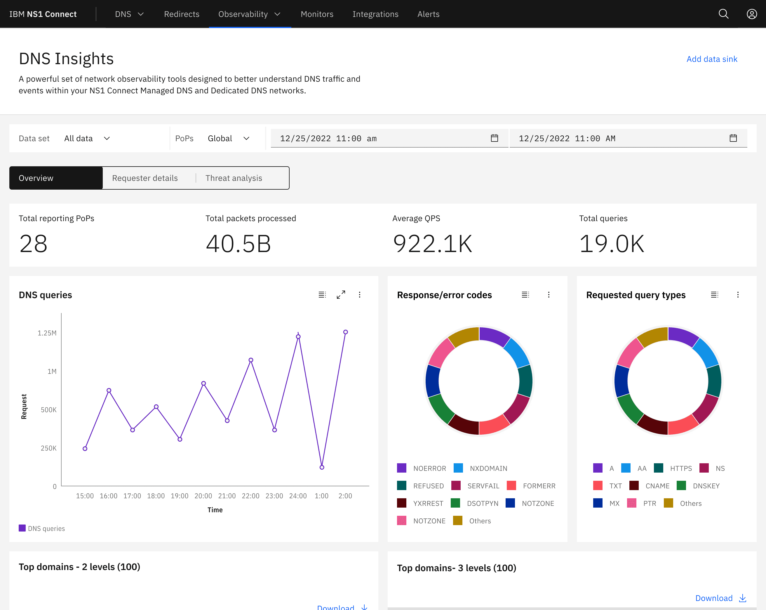
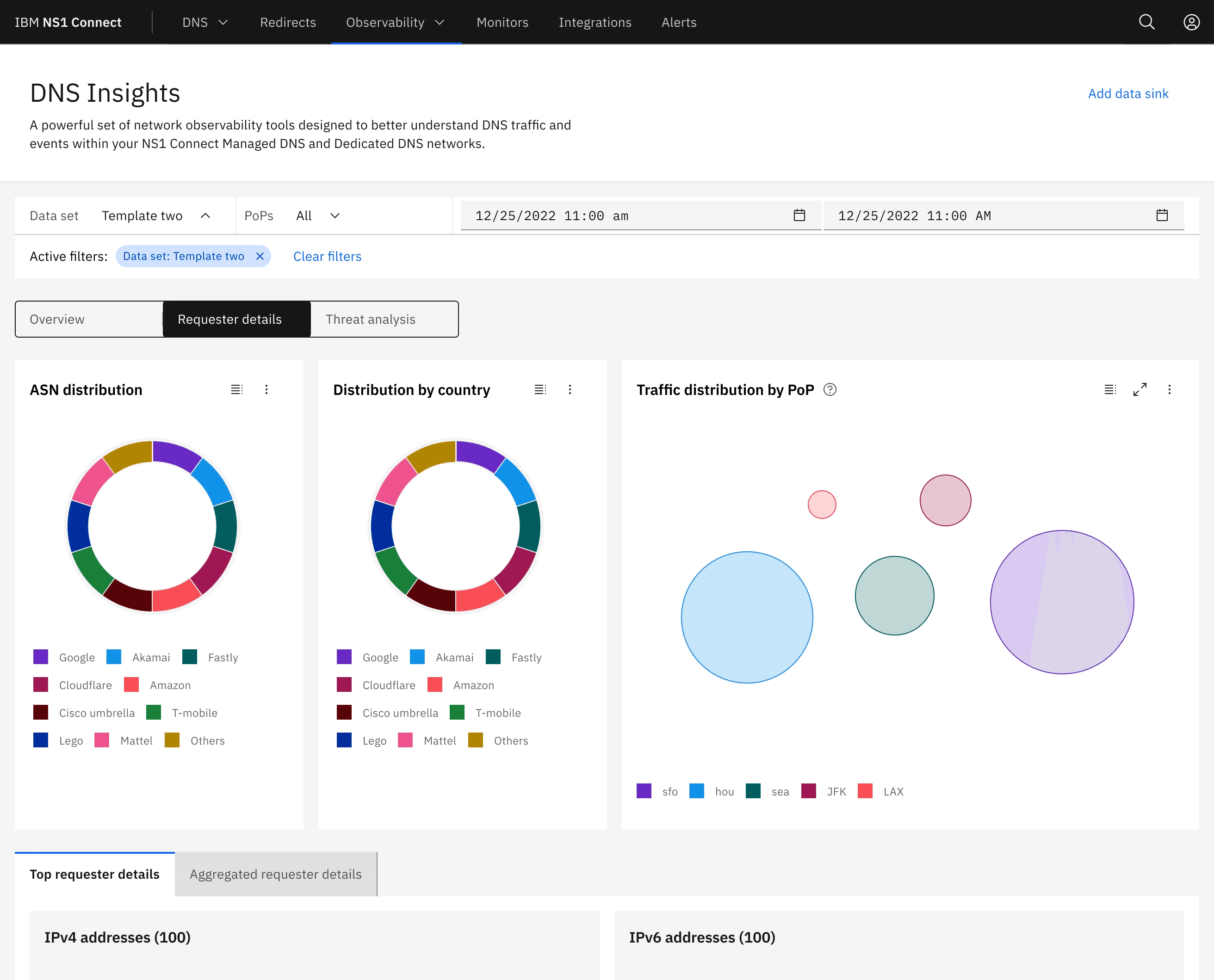
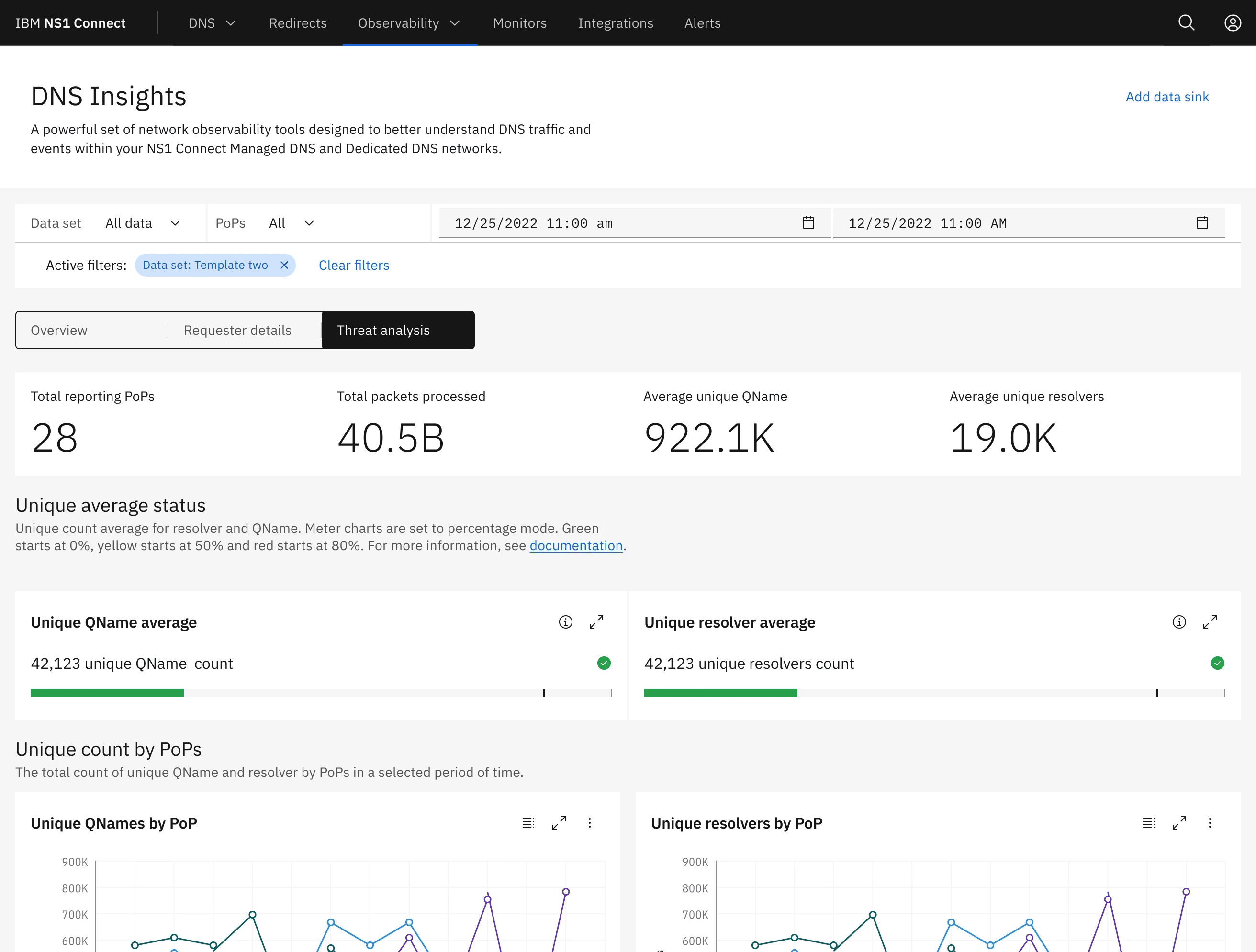
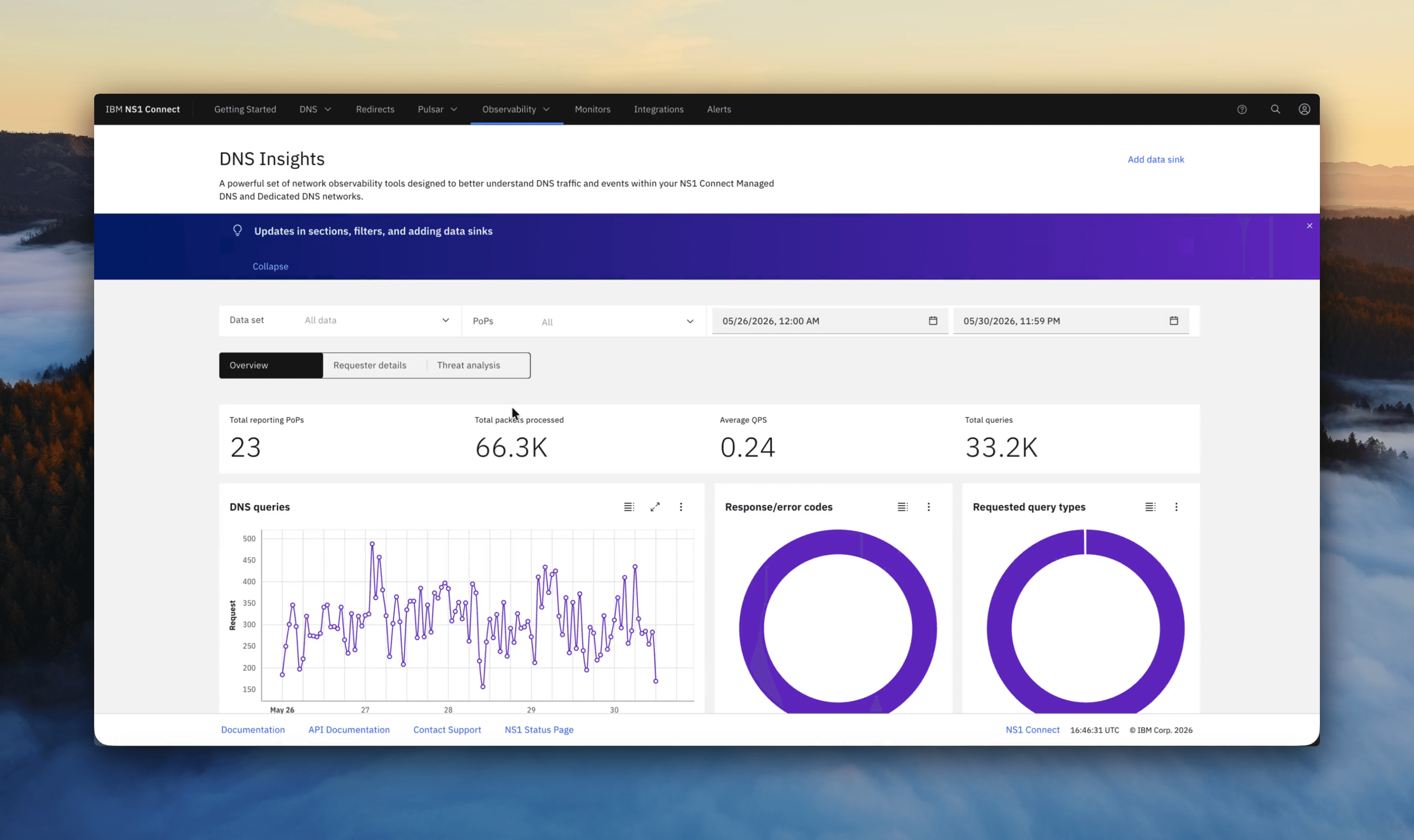
A universal layout with 33 charts in a dashboard that is organized based on what phase of troubleshooting a user is in.
Organized for the user to get a pulse check on their network, dive in on where an issue is, cross reference for malicious attacks.

A universal layout with 33 charts in a dashboard that is organized based on what phase of troubleshooting a user is in.

Organized for the user to get a pulse check on their network, dive in on where an issue is, cross reference for malicious attacks.

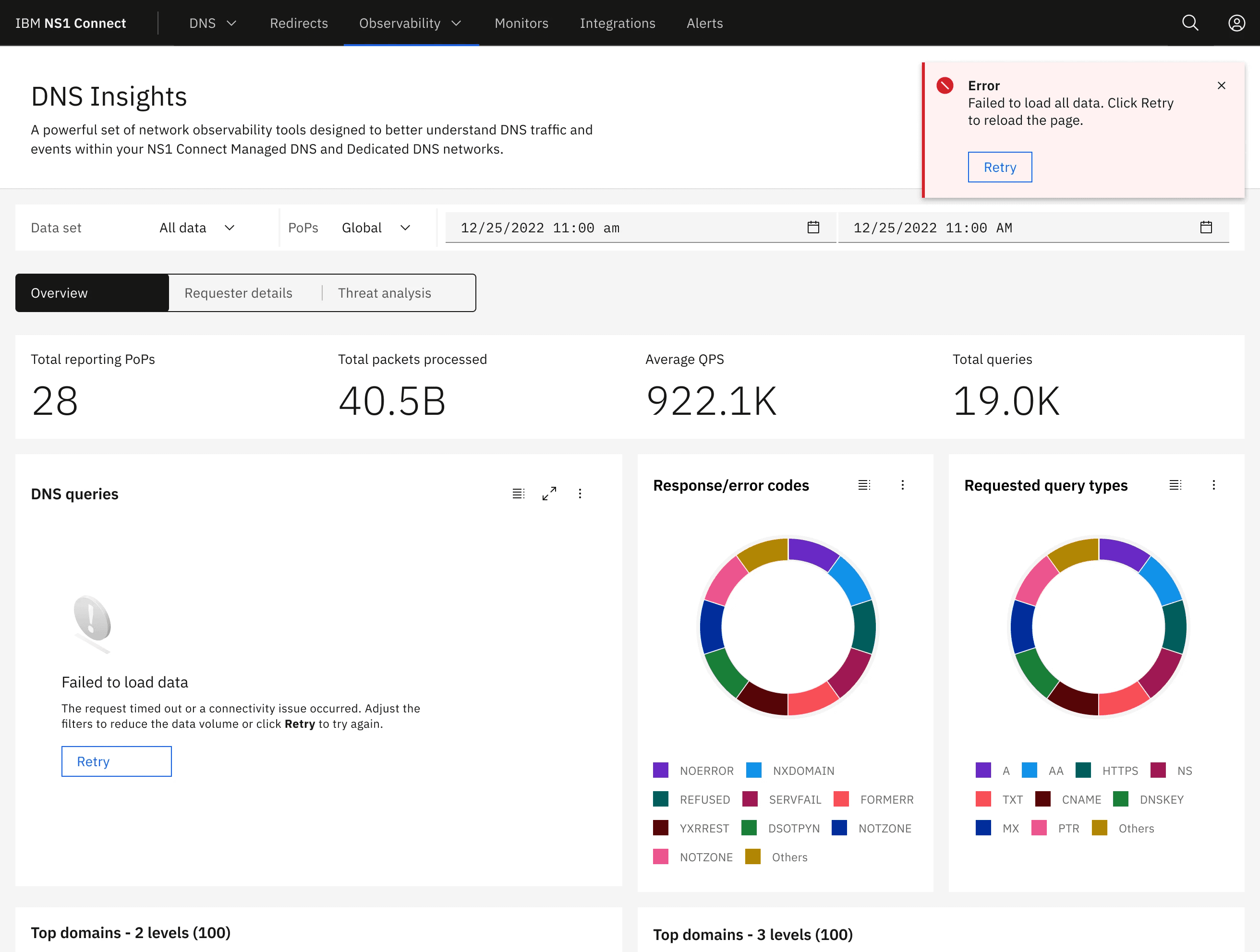
I removed 10 charts, content switchers to give a flow to navigate charts, labeled sections for more clarity on specific charts, accordions to consolidate groups of metrics and to speed up the loading time. With this update the feature users now are able to see the data in the correct order of how they troubleshoot network health and query spikes.

I removed 10 charts, content switchers to give a flow to navigate charts, labeled sections for more clarity on specific charts, accordions to consolidate groups of metrics and to speed up the loading time.

With this update the feature users now are able to see the data in the correct order of how they troubleshoot network health and query spikes.

Results

75%

Customer satisfaction

Held an early preview and set up user interviews

22+

Preview sign ups

Of current customers with the feature accepted early preview access

-30%

Time to complete reduced

Through customer interviews measured how long it took users to navigate the dashboard.

Amaya Mali
Intentionally made, carefully grown.